Uniqueness is a quality that distinguishes art from mere technique. A worker constructing a series of identical shoes does not possess true uniqueness, while an artist crafting one-of-a-kind pieces does.
Typography is a versatile tool that can be used in many different artistic mediums. It can also be manipulated to create striking and visually interesting compositions.
Combining Letters
Typography is a unique form of art that can be used in a variety of ways. It can be used in traditional paintings to convey a message or in street art to add a playful element. Artists can also use typography to create visual symbols or logos that represent a brand name or product.
One way that artists can incorporate typography into their work is by combining different font styles. This can be done by mixing serifs and sans serifs or by using a handwritten font to create a more artistic look. Artists can also use overlapping letters to create interesting visual effects. This is a great technique for creating complex and eye-catching designs, but it can be tricky to master. For example, if two letters have angled strokes, it may be difficult to combine them without compromising the appearance of each letter.
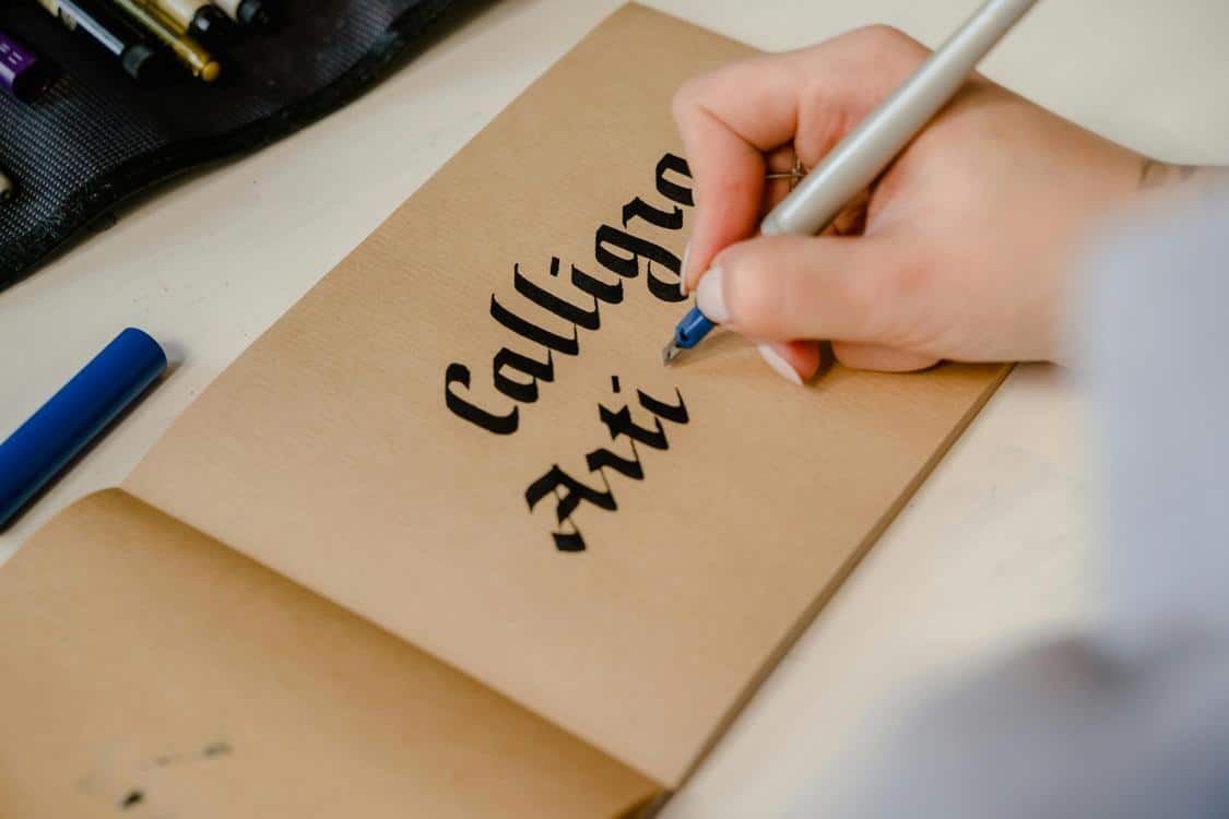
A Psychedelic font can add an eclectic and funky feel to a design, while Gothic or Blackletter fonts can give a more historical or dramatic effect. Combined with the right background or color, these types of fonts can help to create an overall cohesive design.
Another way that typography can be used in artwork is by using it to create optical illusions. For example, a 2D drawing can be made to appear 3D by adding shadows or by changing the opacity of the font. In addition, some artists create sculptural pieces that are designed to be viewed from different angles. For example, this piece of string art by Pae White is a stunning example of typography used in art to trick the viewer’s eye.
Artists can also use typography to make bold statements in their work. For example, a painter can use large block letters to communicate a message or a street artist can write words in bright colors to attract attention. Artists can also use typography to make a statement about social issues or political views.
Typography art is a fascinating form of art that allows creators to express their creativity and experiment with new techniques. Whether it is through innovative methods such as kinetic typography or 3D lettering or by using unconventional mediums, this type of art continues to evolve and capture the attention of audiences around the world.
Mixing Font Styles
Typography is all about contrast, and mixing font styles can help you create a unique look for your designs. However, you need to be intentional about your use of fonts and think about how each one will complement or contrast with others. There are a few basic rules of thumb that you should follow when pairing fonts, and these can help you avoid creating a messy design.
First, you need to choose fonts that have similar moods and can work well together. For example, serif fonts with sans-serif fonts tend to work well together because they create visual distinction between different parts of the text. The typefaces should also have similar proportions, so they fit well with each other and are easy to read.
You can also mix fonts within the same family, but you need to be careful about this. Fonts in the same family have a similar personality and may compete for attention in your design. If you are not careful, your text will feel disjointed and messy. Instead, try to limit your font selection to two or three fonts and choose a superfamily with both serif and sans-serif styles.
When choosing fonts, you also need to consider their weight. Heavily weighted fonts tend to be more formal and traditional, while lighter fonts are usually more casual and contemporary. The fonts should also be appropriate for the type of content you are designing. For example, a corporate report might use a heavy font, while a wedding invitation could use a light font.
Another consideration is the font’s height and width. Tall fonts are generally more legible, while narrower fonts are easier to read in smaller sizes. You should also be careful about using ligatures, which are special characters that combine letters into one glyph. These can cause confusion for readers and should be avoided if possible.
Once you have selected your fonts, you can start experimenting with different combinations to find the best ones for your project. You can also try printing out the lettering on a piece of tracing paper and placing it over your project to see how it looks before committing to the final design. This can be a great way to practice your font combining skills and learn more about how to create a professional, polished look for your crafts and DIY projects, similar to how a rub on transfer company would accomplish things.
Combining Characters

When it comes to character designs, you want them to be eye-catching and memorable. One way to make them stand out is by combining different characters. This can be done in a variety of ways, including using different font styles, adding combining diacritics, and even mixing font colors. However, you must be careful not to overdo this technique or you may end up with text that looks messy and confusing.
In a font, combining diacritics are used to modify the appearance of base characters. For example, a macron combined with the letter c can display a curvy c. This is known as a ligature. Combining diacritics can also be used to create special characters that are not available in the standard Latin alphabet. For example, a cedilla and a tilde are both combining marks that can be used to represent sound variations or accents.
There are several blocks of combining diacritics in Unicode, including the main block for European languages and the International Phonetic Alphabet, as well as the Hiragana, Katakana, and Devanagari blocks. These combiners add a series of diacritic signs to other characters, and some can be stacked above or below each other.
Some people use combining characters to create Zalgo text, which is text that appears “corrupted” or “creepy” due to an overuse of combining diacritics. This can be difficult to read and can cause overlapping or other problems in some software programs.
For programmer, a Unicode code point represents a single character (with the exceptions noted below). However, an end user may not consider this to be true; they would most likely prefer to think of a sequence of characters as a grapheme or a glyph. For instance, the syllable “ktu” may be represented by either the sequence of A + COMBINING RING or by precomposed glyphs in the Devanagari script, but both are considered the same syllable.
Overlapping Characters
Typography is more than just fonts; it’s an art form that conveys a message and creates a symphony of shapes. While there are some standard typography rules to follow, it’s important to push the boundaries and find your own unique design expression.
One way to do this is by combining letters. This technique can be used to add a fun, playful aesthetic to your designs. For example, you can twirl letters together to create a vine-inspired design. This is a great way to show off your creativity and give your designs an element of surprise.
There are many resources available to learn about typography, including the Abduzeedo blog and Type Republic. Both of these sites provide tutorials and inspiration for designers interested in typography. They also offer a marketplace where designers can share their unique typography creations. There are also several online courses that focus on typography and can help you develop your skills. These courses will teach you the basic principles of typography and how to use them to create impactful compositions. They will also teach you how to experiment with different font styles and techniques.


