Artists have long harnessed the power of color to evoke emotions and communicate ideas.
Color can calm, excite, and sometimes even promote healing.
Pablo Picasso once noted the emotive power of colors, recognizing their capacity to reflect the dynamics of human emotions.
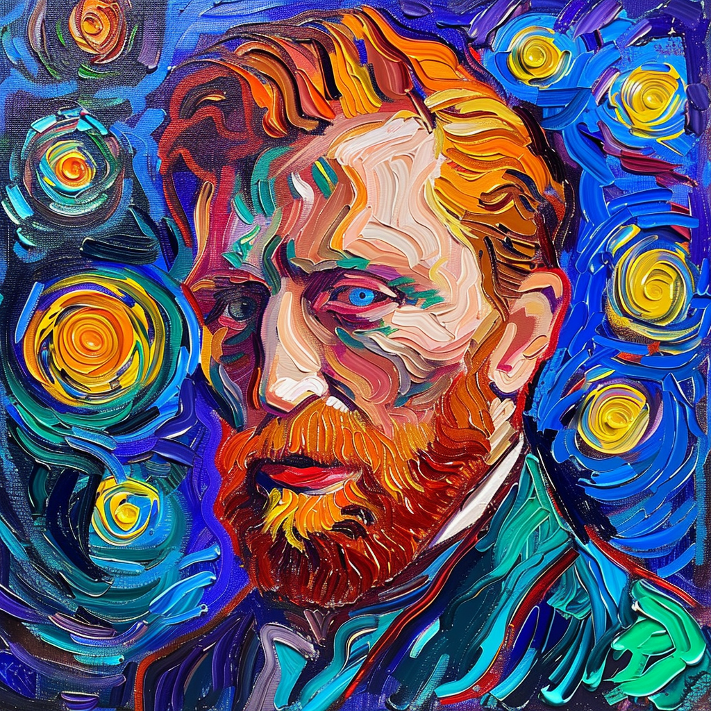
Vincent van Gogh and Color Interplay
Vincent van Gogh recognized color as a primary force in future art landscapes.
He saw interdependence among colors, evidenced in his works such as “Bedroom in Arles.”
In this painting, he highlights the necessity of colors like blue, yellow, and orange to coexist and play off each other.
Claude Monet and Light’s Influence on Color
Claude Monet’s infatuation with color was no secret.
His “Rouen Cathedral” series showcases his study of how light influences the perception of color.
Monet urged painters to focus on colors in their purest form, freed from the constraints of the objects they define.
Georgia O’Keeffe’s Energetic Color Compositions
Georgia O’Keeffe spoke volumes with her color choices, often choosing bold hues to create tension and harmony.
Her painting “Lake George Reflection” serves as an example, combining complementary and analogous colors to navigate viewer emotions.
- Contrast: Utilizing reds and greens to create a dynamic tension.
- Harmony: Adopting red’s variations against purples and blues intermingled with greens for a soothing effect.
- Balance: Articulating form with strategic placement of black and white, amplifying the painting’s vibrancy.
J. M. W. Turner’s Radiant Yellows
J.M.W. Turner’s works are celebrated for their luminous quality, often featuring prominent use of yellow.
Despite critics associating his preference for yellow with a diseased state, he innovated with colors like the radiant Indian Yellow and the hazardous but brilliant Chrome Yellow.
| Turner’s Yellows | Description |
|---|---|
| Indian Yellow | Radiant, derived from mango-fed cows |
| Chrome Yellow | Brilliant, lead-based, and historically controversial |
Helen Frankenthaler’s Color Field Innovations
Frankenthaler’s approach to color evolved, reflecting her abstract expressionist roots.
Her 1960s’ canvases incorporated color-edged compositions and by the ’70s, she adopted Fauvist-like vibrancy.
Frankenthaler continued to refine her work in the ’80s with more subdued colors and relaxed brushwork.
Sonia Delaunay’s Simultaneous Color Contrasts
Sonia Delaunay, with Robert Delaunay, championed “Orphism,” marrying geometric shapes with strong colors for a dynamic visual impact.
Their work underlined the interactive nature of color, particularly how two colors in proximity can enhance or change each other’s appearance.


